The leaking theatres
A splash of NHS architectural history.
A splash of NHS architectural history.

An effort to build an opinionated super-Smartypants.
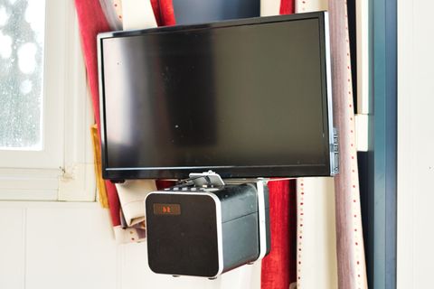
My elaborate and highly-sophisticated project to create an acceptable 19″ TV for less than €80.

Logo, branding, and a bog-standard WP site.

One from a little collection of coastal photos. Ludicrous light for December.
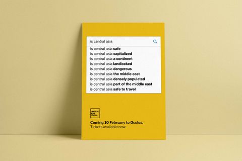
The Central Asia Forum’s first print run of bright yellow posters is ready for pasting
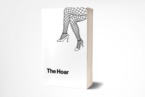
In a last ditch effort to make lots and lots of money from The Hoar, we’ve started printing a bloody massive book full of it.